Tuesday, November 30, 2010

A Book Burning


The sweet satisfaction of yet another completed DMF project juxtaposed to the furious frenzy of looming finals leaves me with the twisted urge to liberate my heroes, to unleash them on an unsuspecting world, to let their ashes rain down upon the earth after a celebratory hempfire of their book debut.  Ganja Boy would approve.  The truth of the book, however, of Captain Ashland & Ganja Boy, would be much better disseminated through the book’s publishing, though the second half must be included first…hahaha, second, first.  Sometimes this writing is just too much fun.   Mamajuana (moi, that is, my character in one of the many Captain Ashland & Ganja Boy adventure sequels simmering on the cerebral stove) aims to do just that – to bring “Ganja Boy’s Big Plan” to its exciting conclusion during quarter break and to do the “finesse” step(s) to make the first book publishing ready.

The production schedule set out for this project was met, with the exception of being a day late with the first “dummy” as somehow I thought the 15th  of this month was Tuesday, my lab day, and not Monday.  (ARGH!)   The pages were concept complete and ready for the “dummy”, but I, alas, had a momentary “dumb blonde lapse”.  This last week of production proved to be the most interesting as I worked through my plan of basically completing at least one page a day since the cover was already done.  IT WORKED!  Captain Ashland & Ganja Boy flew on schedule, 11/29/10.  That being said, I suspect there will be changes still coming as I add the second half of the story and finalize the lay out of the total work.

The space – time continuum traveled on route to completion was far less bumpy with the knowledge gained this quarter.  Indeed, prior to this quarter, I would not have been able to do this project at all.  Tools most commonly used were lots of different layer adjustments, painting, cutting, various selection devices, shape devices, texts, rasterizing, ayyiyi!  I can’t remember them all.  And that’s just Photoshop.  InDesign tools included frames, text wraps, object arrange, and more.  I can’t believe I know this much from just this quarter!  Admittedly, there is much more to learn, specifically about paths, channels and masks.

Thankfully, this knowledge enabled me to accomplish the layout and design that I feel works for my book.  My intention was to be somewhat like a comic book, but with more text, so I incorporated more text on certain pages while still trying to maintain a comic feel to the book as the story is completely playful and absurd.  The idea was to support the story visually with an affinity for comic graphics as opposed to just a book with pictures.   And so, I’m hoping my heroes are truly flying with this first installment of their adventures.

Captain Ashland & Ganja Boy Fly!!!


Sunday, November 28, 2010

book...

didn't seem like there was actually an assignment of essay or blog this week, but covering my bases, thought i'd put something out here anyway.  my book is clearly a work in progress still, though it is way farther along than the dummy paste up from last week.  i haven't decided just how i want it to look because there is still much more experimentation to do, but have a good start in the direction i think i want to go with it.  the story of this particular adventure is in two parts with this installment being the first half.


Tuesday, November 16, 2010

book update...

mistakenly thought that when you worked in indesign, as opposed to using one of the templates provided, the pages were typed in as a reader would view each spread and the program then altered the page order and printed according to the required printer's view.  found out this is not so!!!  corrected the indesign file so that it reflects the printer's view.  in other words, my pages are in order now. whew!  "technical difficulties" prevent me from posting the correction.  thought i uploaded to my 'p' drive correctly, but apparently not as i can't get my file.  argh!  will post tomorrow from the lab computer.

Sunday, November 14, 2010

on books...

So, at about 9:15 on this Sunday night, I have decided to comment on Sara Marier's book idea.  I love it.  The idea to use pictures as text to further "illustrate" the main picture is playful and original.  I can't wait to see the picture story unfold.  I also like the idea to place the smaller pictures in movie reel, as if each large picture has its own little movie documentary telling its story.  I'm looking forward to seeing what those stories will be.


As for my book, what is posted is part one of Ganja Boy's First Adventure.  For both, part one and part two, the story is written and the requisite pictures have all been taken so that this next week will allow me to work on PhotoShop creating the effects I would like in my book and to get part two into InDesign. 

ganja boy's first big plan...


Sunday, November 7, 2010

The BOOK...

The book, the first installment of a series, its debut, 11.29.10 -- the fictional and fascinating story of Captain Ashland and Ganja Boy and their many mishaps and misadventures in the area around the smallish college town of Ashland, OR...and east, west, south and north somewhat.  This first installment will introduce one of the duo's many archnemeses and may hint at the duo's origins, the why of it's becoming, a possibility totally and directly dependent upon the amount of Ganja Boy's ganja gone up in smoke.  It should be here so noted that Captain Ashland is quite straightlaced, but could probably use, says his co-conspirator, "just one hit, Dude".  The story format will likely be somewhat comic bookish with maybe a bit more text than is typical of that genre.  As I am not the consummate artiste, my plan is to use a combination of photos and some drawing and lots of photoshop help to bring these characters to life.  The goal is to publish.


Copyright © 2010 by Wendy Temple

Tuesday, November 2, 2010

yadda, yadda...

how many poster posts can a person post???  redid the letter 'a' background in cap'n ashland/gb to show grey space rotated as it was in the pre-jpeg photoshop file.  still don't know how it came to be unspun....

LAST!!! poster post...

curiouser and curiouser...

Just noticed that the Cap'n Ashland/GB poster does not have the grey space in the background of the big letter 'a' rotated a bit to show some white space.  In my photoshop file, it is rotated, but when saved as a jpeg, somehow it 'unrotates'.  Can't figure this out.  The effect is more interesting with the rotation there.

Reflections on poster reflections...

A quick aside:  For my son's promo flyers/posters, I didn't think the text was strong enough the first time around, but was, frankly, sick of looking at the computer screen any longer.  With the revision period grace given, I decided to turn my attention to that right away with the first attempts ending up with text that was too big.  Revising again resulted in the last posting of the Nick Temple posters.  I did have one oops moment when I deleted the pic of him, and then decided I actually liked the poster without the pic as well, so it is also included.

For Captain Ashland and Ganja Boy, I never liked the cropping job on Ganja Boy's elbow.  After having worked with the eraser and the blur and smudge tools, I think that problem area is corrected.  I also moved the title text down a hair so it is no longer right on the top edge of the poster.  Finally, I added a bit more info at the bottom of the poster to indicate there is a book in the works, and had some miraculous luck backlighting the blue text with yellow.  woohoo!!!

captain ashland, revised


Sunday, October 31, 2010

i've been posterized...

I just love when I can answer three of the reflective essay questions with one answer...creative textography -- hahahah.  For my "movie"/"book" promotion poster, I used a glowing flame text effect for the first time to bring out the letters and to add attention grabbing color to my poster.  This had the added benefit of also capturing Captain Ashland's 'super nova vision'.  Wow.  Three questions answered.  Technically, my reflection is done, but I wouldn't want to deprive you's all of further titillating diatribe. 

So, I chose my poster genres because I actually had those exact two subjects to promote -- the Captain Ashland & Ganja Boy poster is for the upcoming first publication of the 'graphic novel' of the same title, to be completed for the final in this class and the Nick Temple music poster is to publicize my son's ongoing gig at the local Mexican restaurant, Miguel's.

Finally, I wanted to communicate a certain 'artsiness' and maturity of musicianship to the poster for my son.  I wanted to portray his musicality in his facial expression without making it too prominent or overstated, and I wanted it to be obvious that he was playing acoustic guitar without having to spell it out.  The simplicity of the poster, I think, lends itself to accomplishing these goals.  Captain Ashland, on the other hand, is a fictional character set in a real location, so I used the combination of real people and the actual Ashland Springs Hotel with the cheesy costuming in the foreground and the graphic 'A' in the background (the 'A' being from our letter assignment).  The characters and the story poke fun at life in Ashland and at themselves and, well, at life in general so I wanted the poster to have a sense of silliness and fun about it as well as a sense of things being knocked off balance...as the grounded center is humorously jabbed  at.

This concludes the banter for this week.  I have bestowed a certain mercy on you by stopping short this week, but that is most certainly all the mercy I have for this quarter.

Sunday, October 24, 2010

Alpha Pic Soup...

First, to whomever of you is going to read my post this week, I must say that I will get more organized in my blog...soon!!!  Just to keep you in the know, this week's work (aka, fun) is to be found in the following posts:  "3 portraits...or so", "last of nature's letters", "more of nature's letters" and "nature's o".  There are a few extraneous pics mixed in -- a cropped version of Q that I didn't really care for, an extra self-pic and a replacement for the emda logo that I had submitted some time ago (somehow, the first logo shadow letters ghosted themselves into nothingess...a mystery.  An aside on the logo submissions, I wanted to create something that would copy well in black and white or in color.)  With that preface out of the way, let's talk about Alpha Pic Soup.


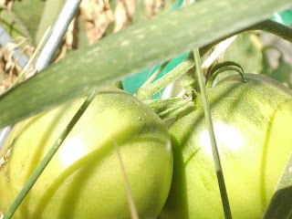
I had so much fun this week looking for letters that I nearly forgot the other portrait part of the project.  Though I was seeing the alphabet everywhere, I decided to limit myself to only those letters nature gave me, no man-made structures, inventions or fabrications qualified.  I also decided to get all but one (the i-palm) in my back yard garden.  In order, as you scroll down the blog, you first find the bee in "last of nature's letters" where between shadows and plants you find constructions of H, V, L, X, T and E.  Ironically, I was at first so tuned into patterns on the bee, I neglected to see all the letters he was sitting next to.  In "more of nature's letters", there is the i-palm in grand scale, the profusion-of-j's bloom (each individual petal is j-shaped), the i-calendula in petite scale, B-tomatoes and the Q-hollyhock, which is somewhat backwards, i know.  When I rotated it to be letter perfect, however, I didn't like it and so let it's inspiration to Q stand as it was.  "Nature's o" was my first pic.  I got down under the leaning sunflower heads and took the pic looking skyward to do their flawless 'o' shape justice.  To get the best light, I moved myself around each of the subject letters.  None of these pictures were altered in any way, not to say that they couldn't use some help, but I was more focused, hee hee, on the camera for this part of the project.  Then, the photoshop fun began.  Using the sunflower pic, I started playing with layer adjustments.  First, some brightness/contrast, then some levels, but while playing, I happened upon the single color fill adjustments and got away from improving the picture, instead moving towards creating a piece inspired by the picture, itself, an inspiration of 'o's, an inspiration of inspirations...hahaha!  Probably, most importantly, I finally figured out how quick select works...I think.  The quick select tool selects all the pixels in your image of the color pixel that you click on.  This was a great moment of enlightenment!!!  (let's not dwell on me finding that out this late in the quarter)  Using that understanding, I created the altered version of sunflowers with fill layers and certain quick selections, such as parts of the flower centers, leaves and sky.  


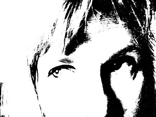
Time to move on to portraits, if I wanted to make deadline!  Self-pic, furry beast and my son unawares to my plans.  Starting with the self-picture as it was, I just started applying different adjustments to see what they would do.  Again, I found something nifty -- threshold something or other.  Applying this resulted in the black and white graphic novel looking image.  In the picture of my dog, Spot, brightness/contrast and levels layer adjustments were huge improvements to the original dark picture.  Hue/saturation adjustments added some fun.  I particularly like the way the wall behind the roses became colored.  Finally, on my son's pic, I played with the usual layer adjustments and then tweeked the perspective ever so slightly giving it more of an upward tilt and side to side shift.  Added some cropping and called it done.  I included the alteration pre-perspective shift and post-perspective shift with cropping.  If you  look carefully, you can see it.  Changing the perspective tweeks the picture in such a way that cropping becomes necessary...the more you change it, the more you have to crop, or so it seems at this point.


Each part of the project offered many learning opportunities, so I'm not sure which benefitted me more.  I do know that, in between bouts of doubts, frightful frights and uncertainties, I am having a great time and can hardly call this stuff homework.  From working on these pictures, both in the taking and manipulating, I have vowed to become more proficient at using my camera and PS.  Mountains and mountains to learn yet!!!

3 portraits...or so


emda to replace earlier mistaken post

selfpic

last of nature's letters

more of nature's letters


nature's o